
1.244
Release date: August 26, 2025
| New feature | Components can now be displayed recursively or non-recursively in the grid.
[
#941
] Users can now right-click on a component in the grid and select/deselect the option Show components recursively from the context menu. This setting is also stored in the widget preset.
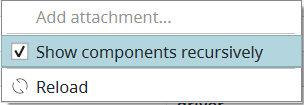 Note: This feature relates to the new component grid, which is still being developed and which is deactivated by default. Currently, the new grid is only used if it is specifically activated with the command Note: In the past, the component grid always showed the components of a group recursively. |
| New feature | The options "Show only assigned attributes" and "Autosize all columns" now have corresponding "always" options.
[
#749
] This feature relates to the context menu, which appears when users move their mouse cursor over a column header in the grid and click on the icon. The context menu now includes the options Always show only assigned attributes and Always autosize all columns. These options are similar to the ‘Show only assigned attributes’ and ‘Autosize all columns’ options. The difference is that they are not just performed once when triggered. Rather, they are automatically performed every time the grid is displayed or reloaded (every selection change). Note: These options can negatively impact the performance, so they are deactivated by default. If activated, they will stay activated even after restarting the client. Note: This feature relates to the new component grid, which is still being developed and which is deactivated by default. Currently, the new grid is only used if it is specifically activated with the command 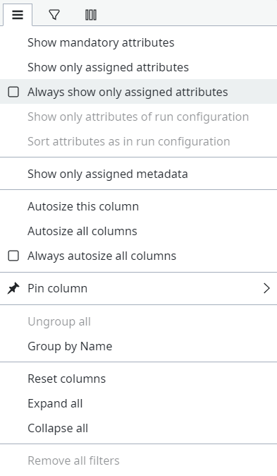 |
| New feature | The original file name is now displayed in the new component grid. Note the following:
[
#11
]
|
| New feature | There is a new function to repair the local database.
[
#32
] This feature relates to the Repair local storage pop-up window, which can be accessed by clicking on the red icon, or by using the
|
| Improvement | Tag icons are now displayed in the "Tags" column of the new component grid.
[
#4
] This improvement relates to the Tags column in the grid. In the past, this column displayed the name of the tag, e.g. “reference” or “status”. This has been improved. The column now displays the tag’s color and letter. This visual aid helps users recognize the tag more quickly. Note: This improvement relates to the new component grid, which is still being developed and which is deactivated by default. Currently, the new grid is only used if it is specifically activated with the command |
| Bug fix | It is no longer possible to change the path of a sub-component.
[
#11403
] This fix relates to sub-components that have been grouped together into a multi component. Specifically, this fix relates to the information that is displayed in the Properties view after having selected a sub-component in the grid. In the past, it was possible to change the path of the sub-component in the Basic information section. However, doing so caused the sub-component to break. The file path has therefore been disabled for sub-components. It can no longer be changed, since all sub-components of a multi component must be in the same group. |
| Bug fix | It is now possible to remove exclusive tags from a pool/tree after the tag configuration was deleted.
[
#54
] This fix relates to exclusive tags. In the past, if a user deleted the tag configuration in the menu Admin > Model > Tags, then the exclusive tag was still visible on the pool/tree where it was set. Furthermore, users were not able to remove the exclusive tag via the context menu. This behavior has been fixed. |
| Bug fix | The "Apply" button is now correctly activated when a history comment is entered.
[
#11404
] This fix relates to the Edit with tab, which appears when editing a component. In the past, the Apply button remained deactivated, even after the user had edited the component and entered a history comment. This behavior has been fixed. |