Back

Search results

      Home / News / Data Analysis 3.0: Recognize clusters, train faster, see relationships more clearly

      Data Analysis 3.0: Detect Clusters, Train Faster, See Relationships More Clearly

      The SCALE.sdm add-on Data Analysis helps visualize trends in experimental data, detect outliers, and create metamodels. Version 3.0 brings numerous new features: automatic cluster analysis, training on the graphics card, a significantly expanded Parallel Coordinates Plot, and a faster start to the analysis.

      With version 3.0, Data Analysis becomes an even more powerful tool to quickly gain reliable insights from simulation and experimental data, directly in SCALE.sdm.

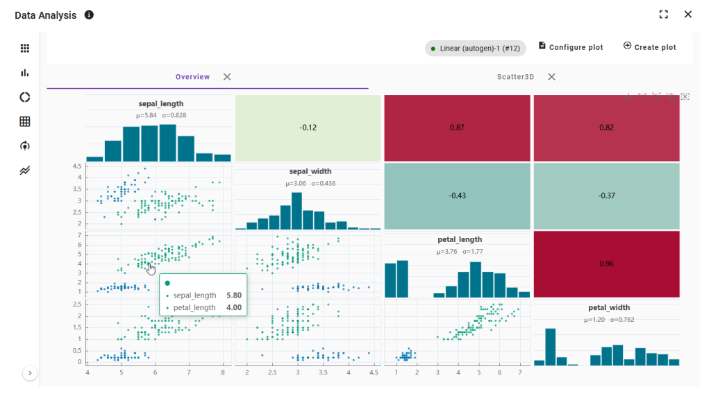
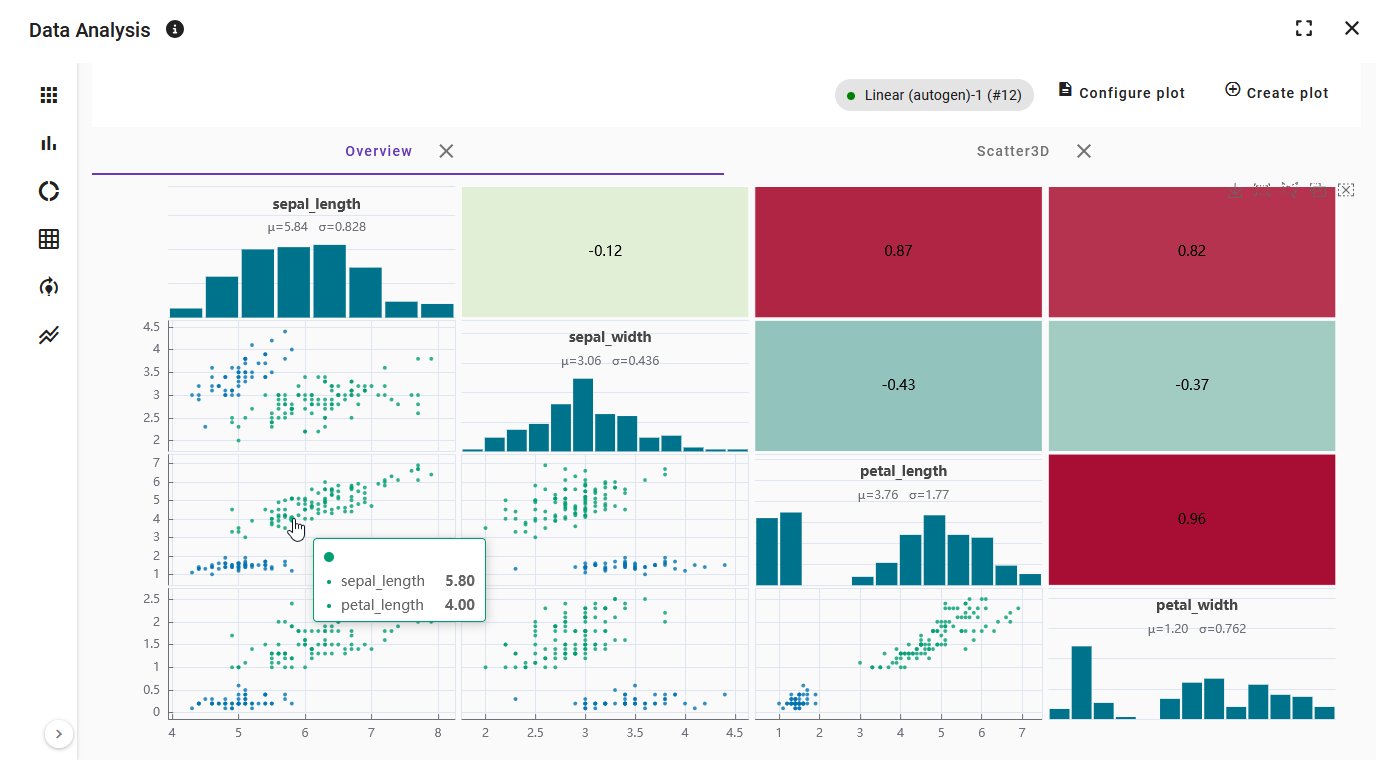
      Übersichtsmatrix mit Histogrammen, Streudiagrammen und Korrelationen
      Die Übersichtsmatrix kombiniert Histogramme, Streudiagramme und Korrelationen.
      Automatically Group Similar Tests

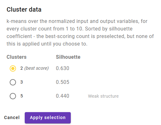
      The new cluster analysis groups tests with similar input and output variables into clusters. This reveals patterns in the data that are not visible in a single plot.

      The add-on uses the k-means algorithm for this, determining the optimal number of clusters. The results are additionally evaluated.

      After applying, each test receives a cluster column in the data table. Each cluster is assigned a color that can be customized and can be toggled on or off in all plots or specifically in individual plots.

      Dialog „Cluster data“ mit Silhouetten-Score je Clusteranzahl
      Jede Clusteranzahl wird bewertet, die beste ist vorausgewählt.
      Uniform Coloring with “Color plots by”

      A single setting now determines how all plots are colored: by outlier status, by label, or by cluster. This ensures consistency across all visualizations at a glance. The new setting replaces the previous selection that had to be set individually for each plot.

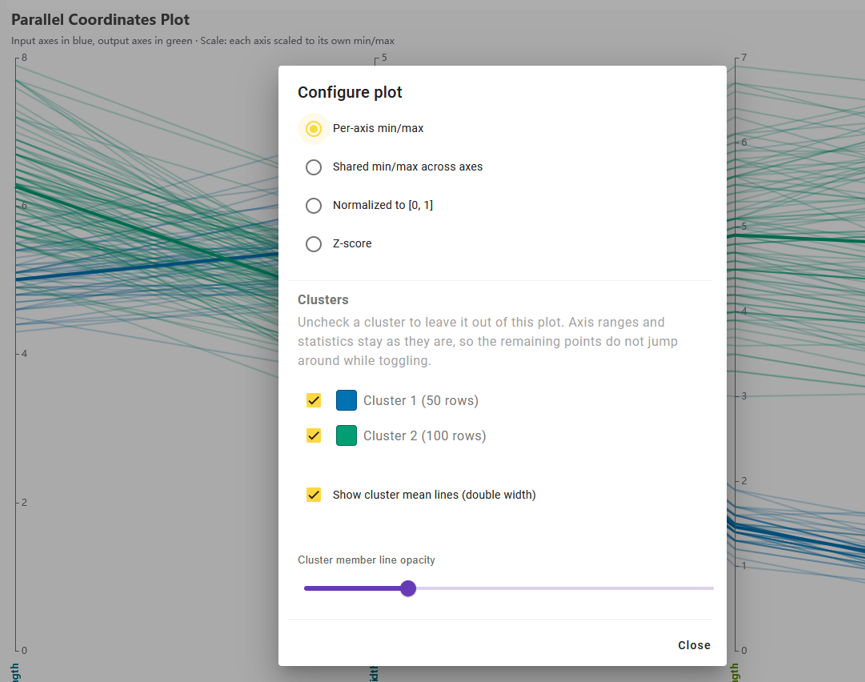
      Konfiguration des Parallel Coordinates Plot mit Clustern, Mittelwertlinien und Transparenz
      Achsenskalierung, Cluster-Auswahl, Mittelwertlinien und Transparenz in einem Dialog.
      Parallel Coordinates Plot: See Relationships at a Glance

      The Parallel Coordinates Plot now takes its axes directly from the variables set as input or output.

      • Four axis scalings: per axis, common value range, normalized to [0, 1], or as z-score.
      • For clustered data, the plot highlights the mean of each cluster as an emphasized line.
      • Individual lines are faded so that the means stand out in the foreground. The transparency can be adjusted using a slider.

      Faster to the Metamodel: Training on the GPU

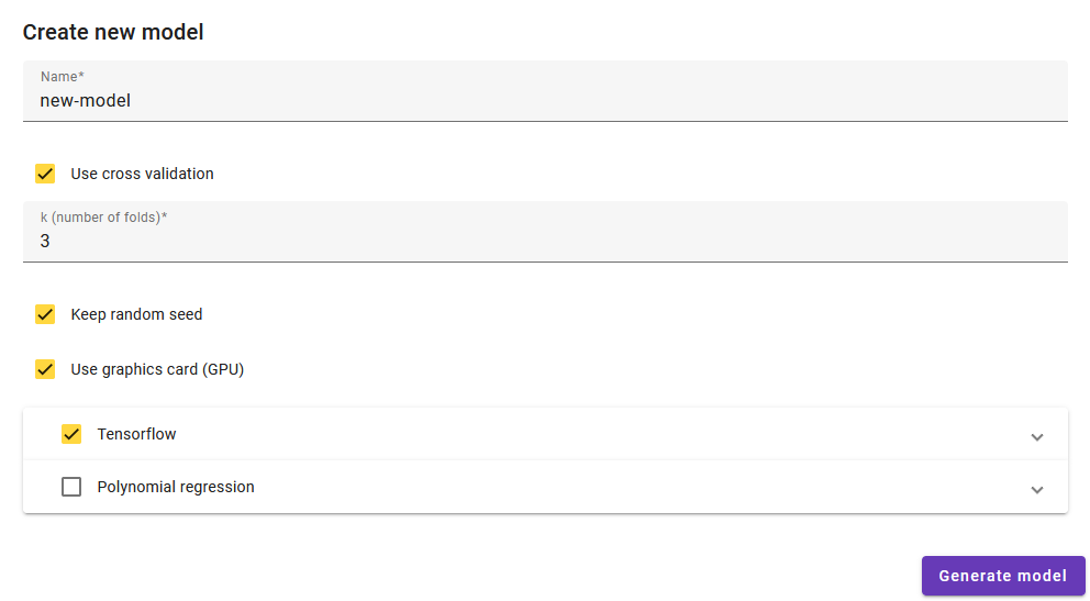
      Metamodels with neural networks are now trained on the graphics card (GPU), if supported by the browser. The option is enabled by default and saved for the next session. No setup is required: if no graphics card is available, training automatically continues on the processor. The model is the same in both cases; only the training duration differs.

      The default settings for neural networks have also been adapted to the typical datasets in the add-on. Training now runs up to 800 epochs but stops as soon as the model no longer improves.

      Model Quality at a Glance

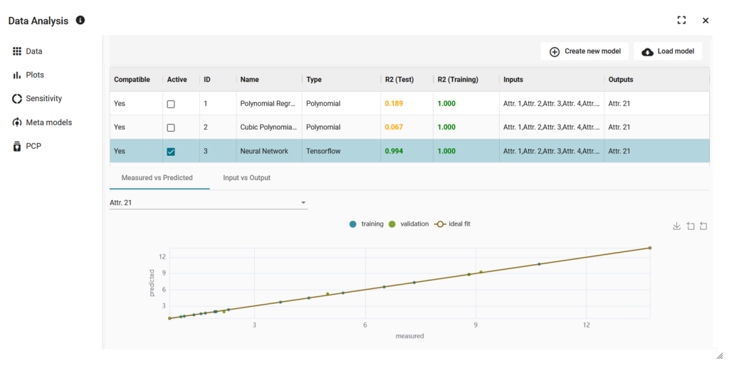
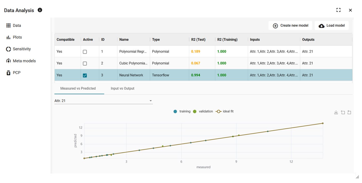
      Each model receives a colored rating that summarizes the values for test and training. It appears in the model list and in the model selection for plots and sensitivity analysis. If a model performs worse on test or training data than a simple prediction of the mean value, the rating is always red. A good training value alone cannot mask failure on unknown data.

      Quick Start into the Analysis

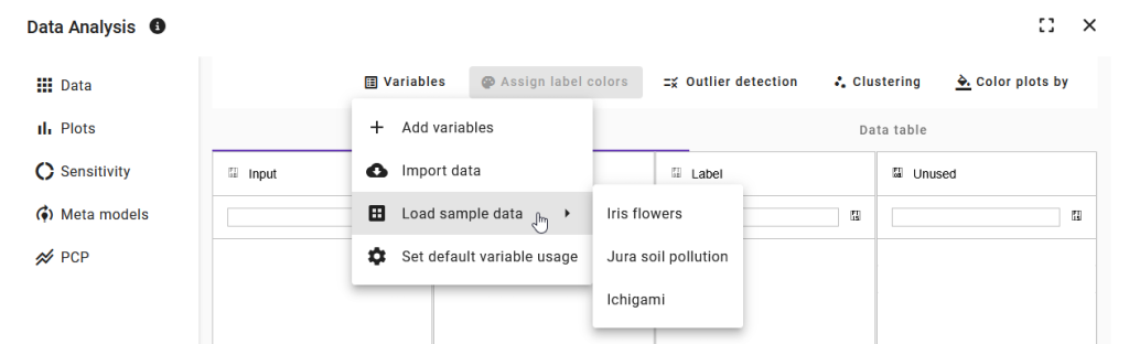
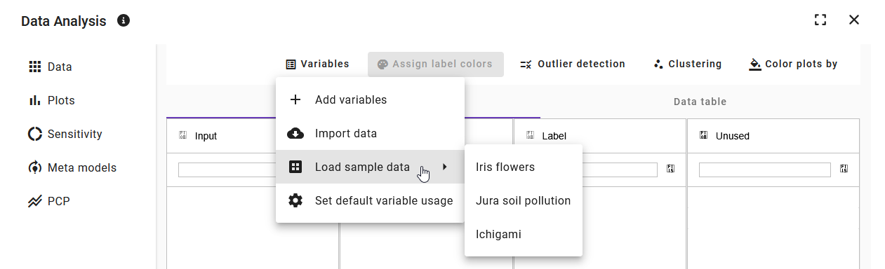
      Three sample datasets are available for the first impression: the classic Iris dataset for first steps with clustering, a dataset on soil contamination with multiple input variables for metamodels, and a synthetic dataset where inputs and outputs are already assigned.

      Further Innovations

      • CSV files can now be opened directly from the attachments section of a test in the add-on.
      • A newly opened dataset starts with an overview matrix consisting of histograms, scatter plots, and correlations, as well as a 3D scatter plot. Additional plots are added if needed.
      • The outlier detection now differentiates between “Reactivate all tests” and “Remove outlier markings.”
      • The panel bar can be collapsed into a narrow toolbar to create more space for analysis.